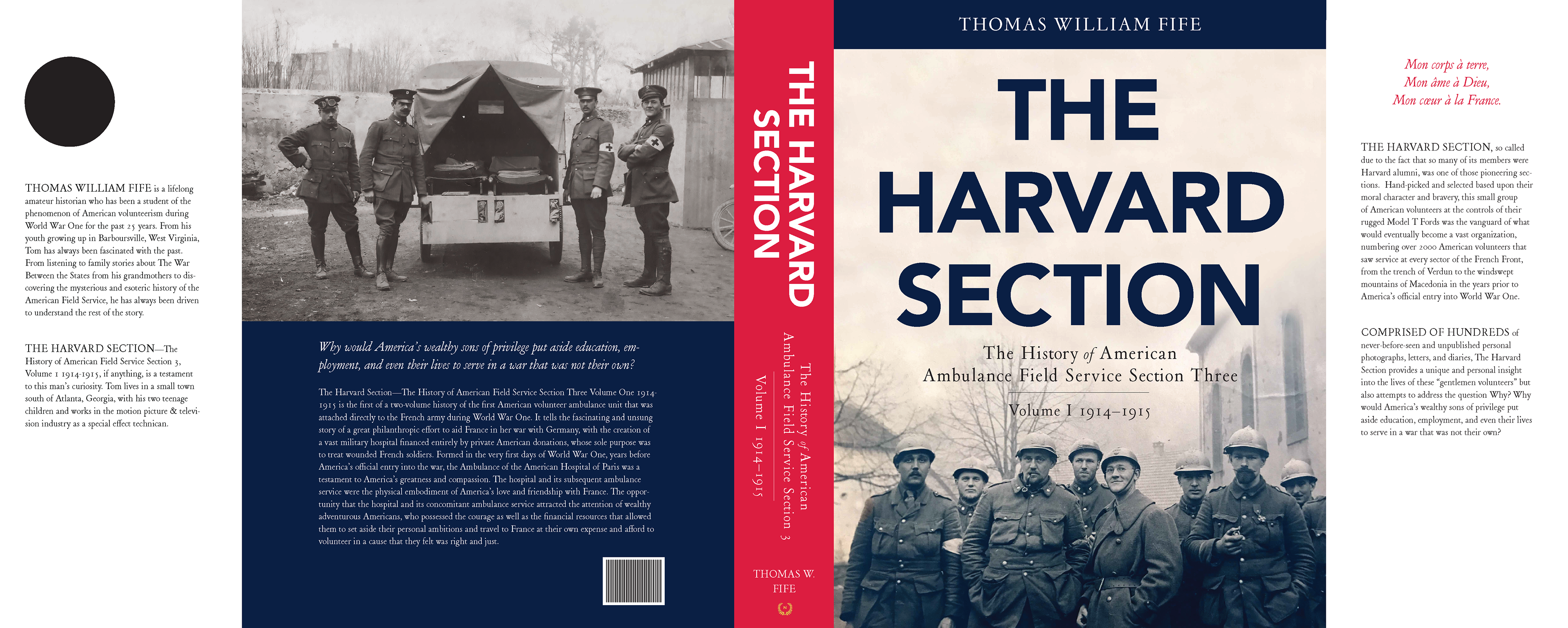
(A book design in progress)
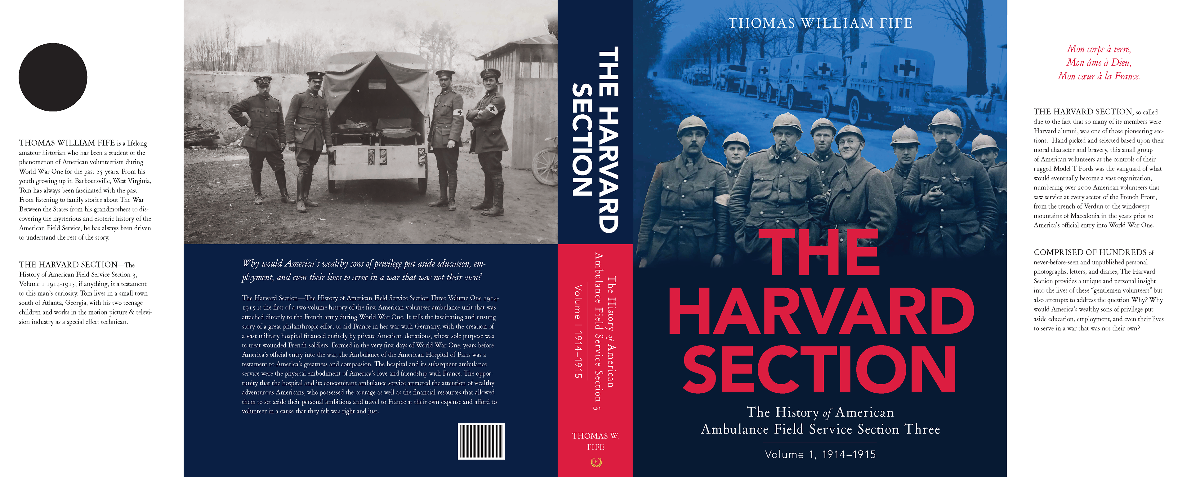
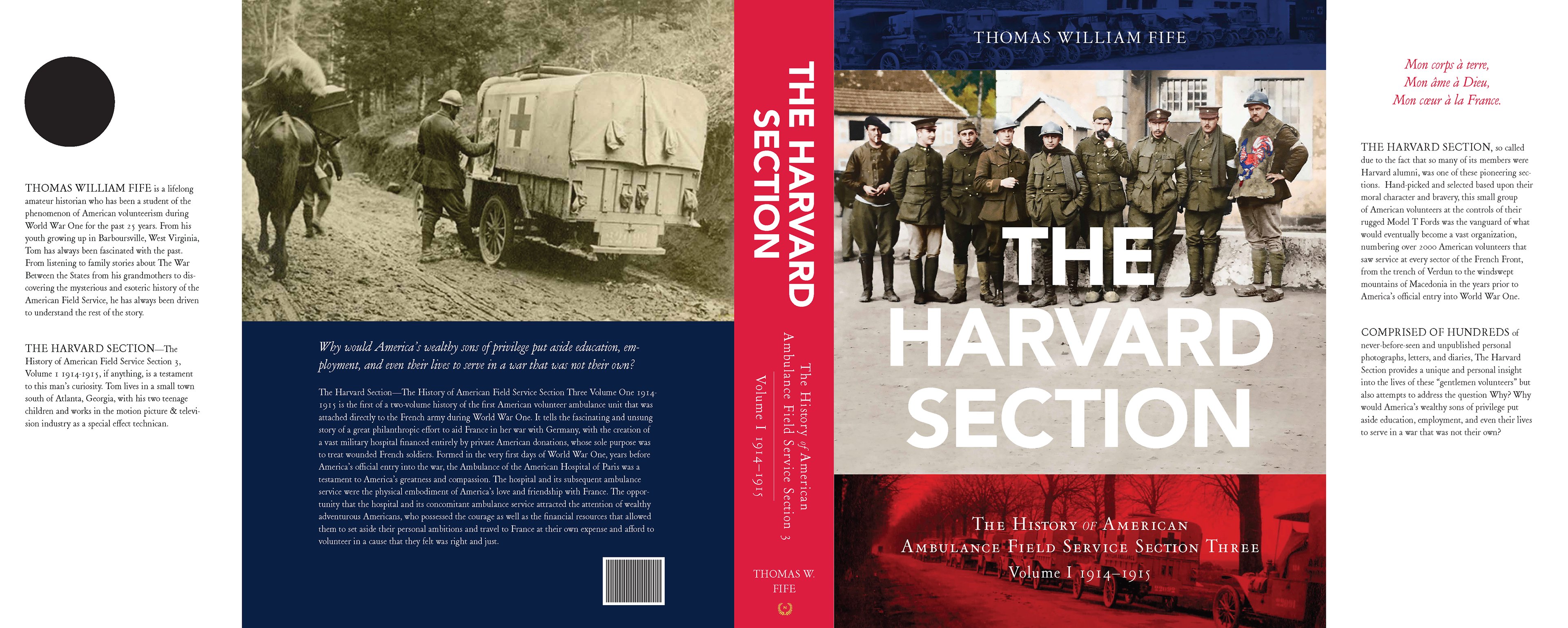
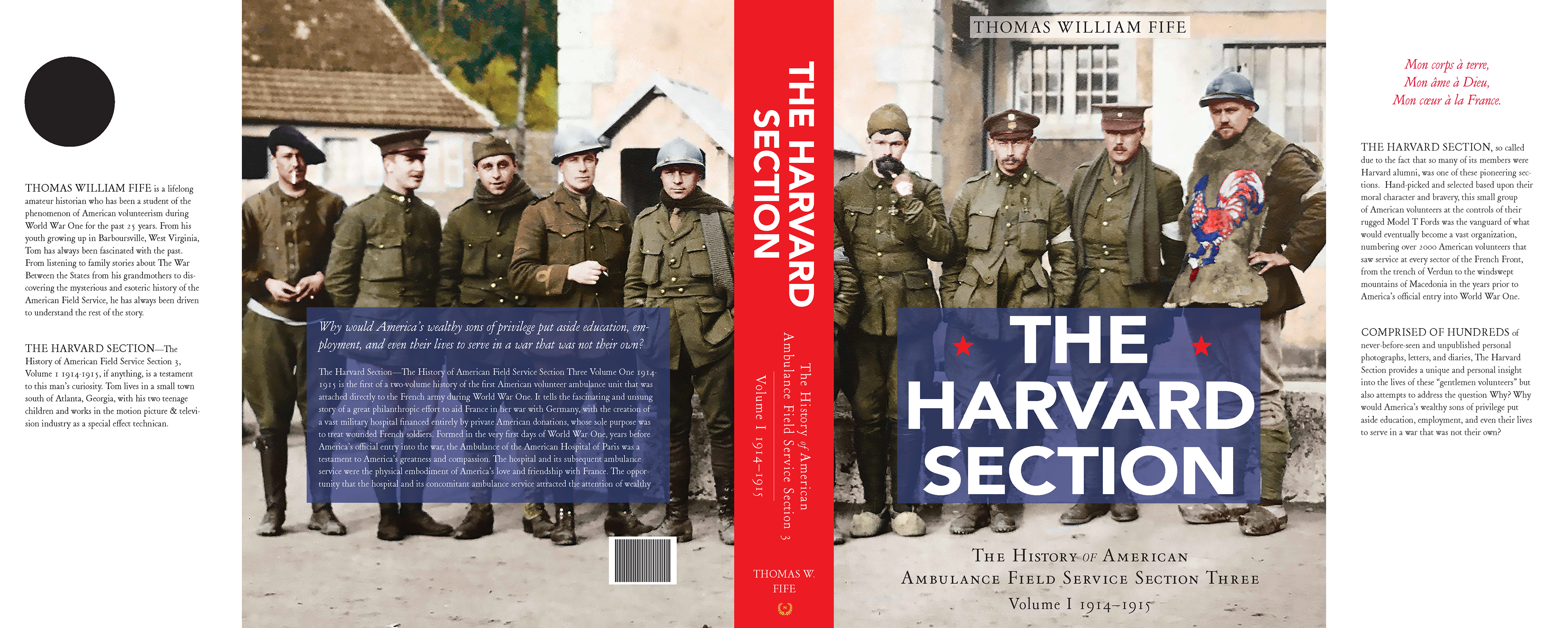
Above: A prototype of the cover jacket for the book. Below: Some cover jacket prototype options.


An example of a chapter opening spread.
An example of a spread where the client wanted two images of the same subject used.
Body text spans a three column grid with an additional wider margin column to accommodate page notes and photo captions. Photos often span all four columns due to client preference.
The margin is also used for smaller images, such as objects or portraits.
Creative use of the grid.
Some sections contain only images. Above contrasts a past photo with a contemporary one.
An edited image to accommodate a two-page spread.
There are some instances in the book where a large number of photos and page notes converge in one place. Above is an example of where ten lengthy page notes and eight portraits had to be fit into one two-page spread.