A rebranding visualization and brand guidelines document for the Seattle metropolitan area transit agency, Sound Transit, which operates a regional bus and train system.
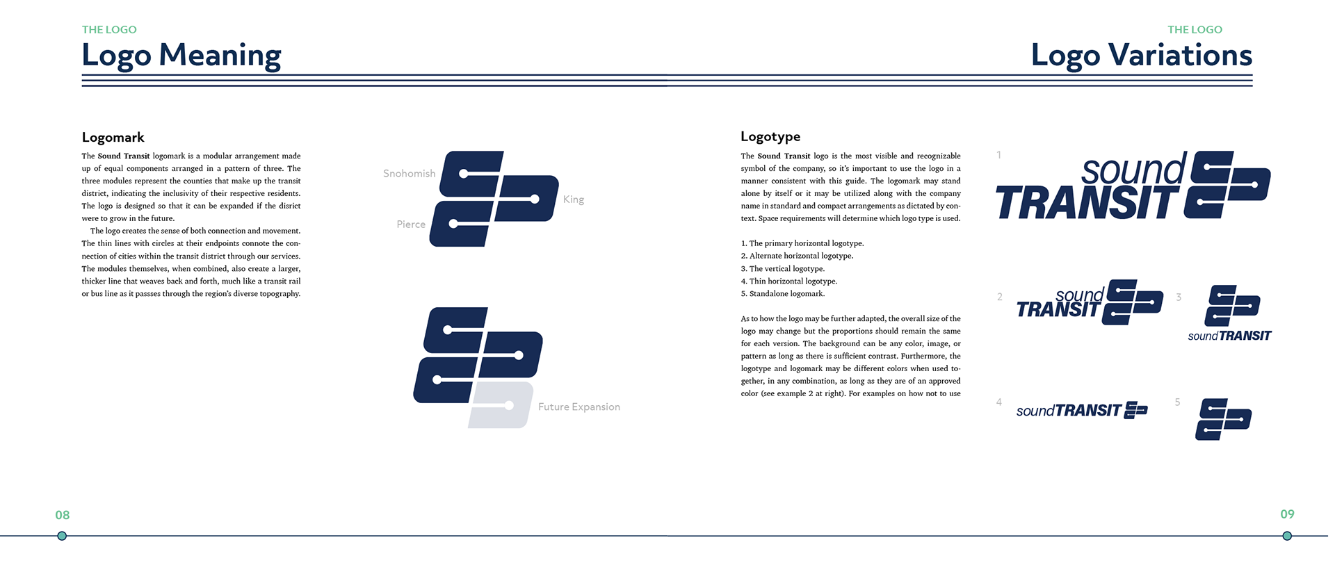
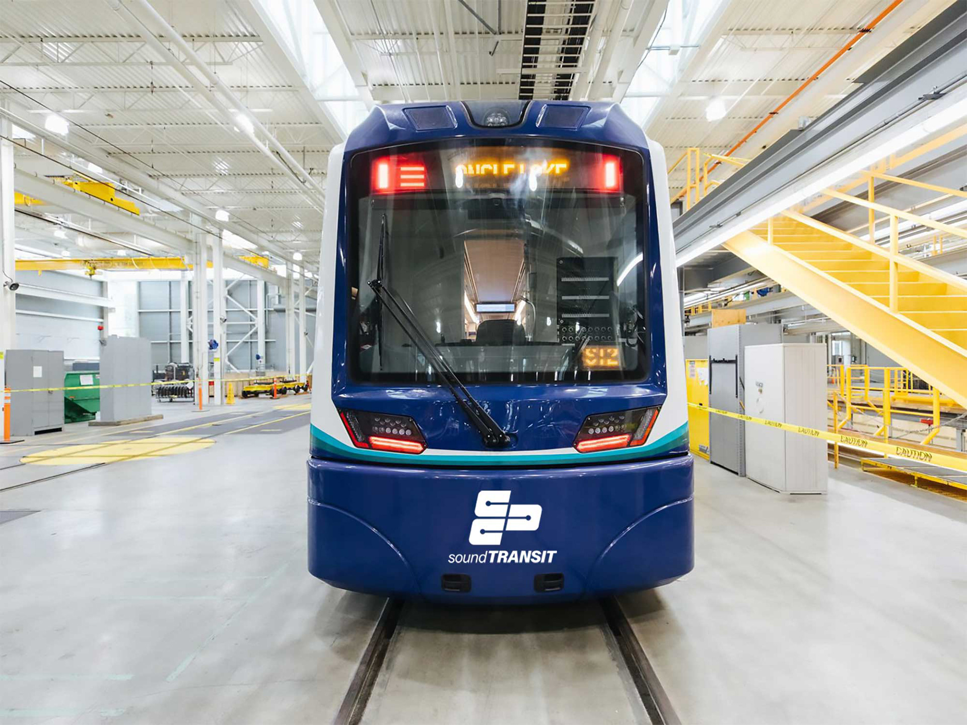
The logo mark emphasizes how the agency will connect the region it serves as it continues to grow. The logo is angled to provide the feeling of motion.
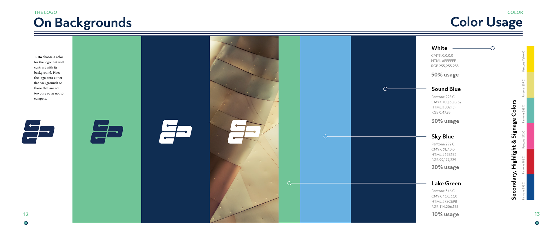
Colors are those often associated with Seattle and the region. Sound Blue on a white background are the primary colors used throughout the brand.
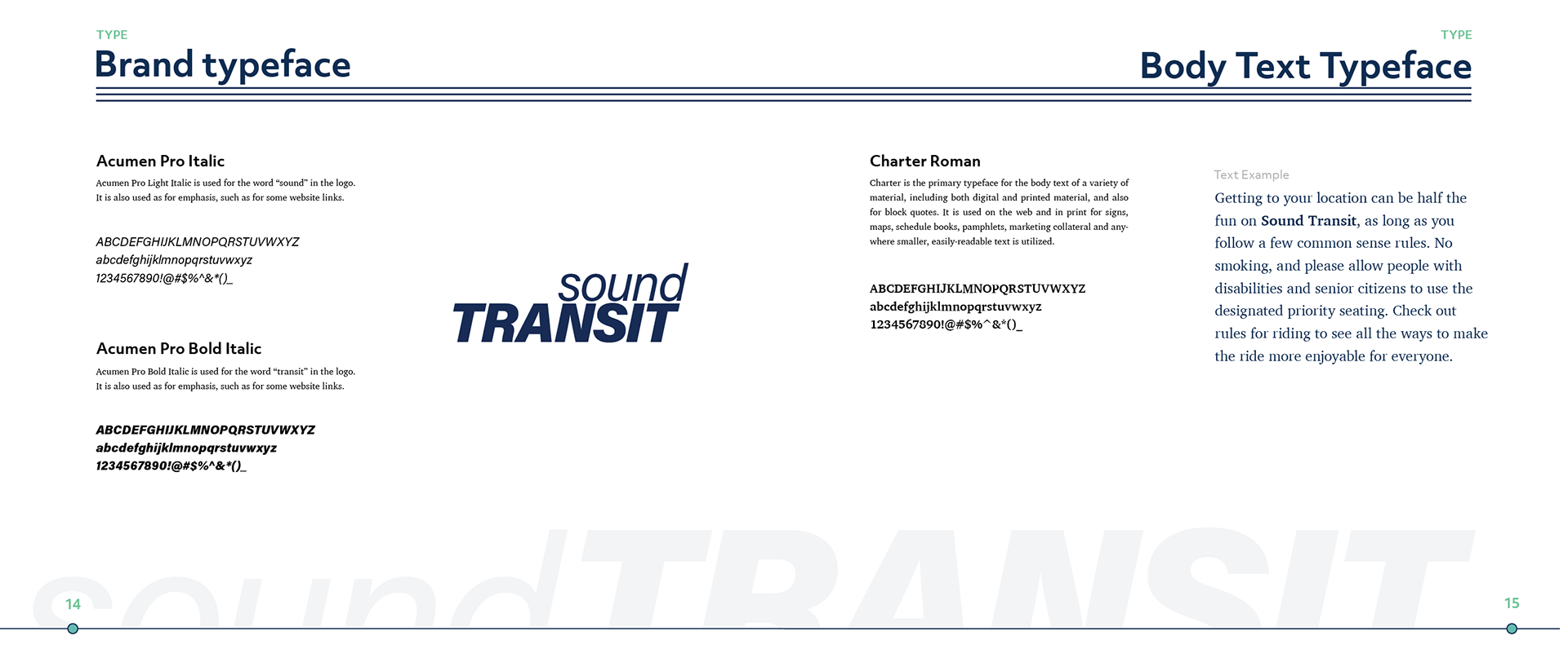
The logo type emphasizes the word “transit” to communicate its importance the company's operations. The word “sound” is softened to evoke the peace and quiet of the sound after which it is named.
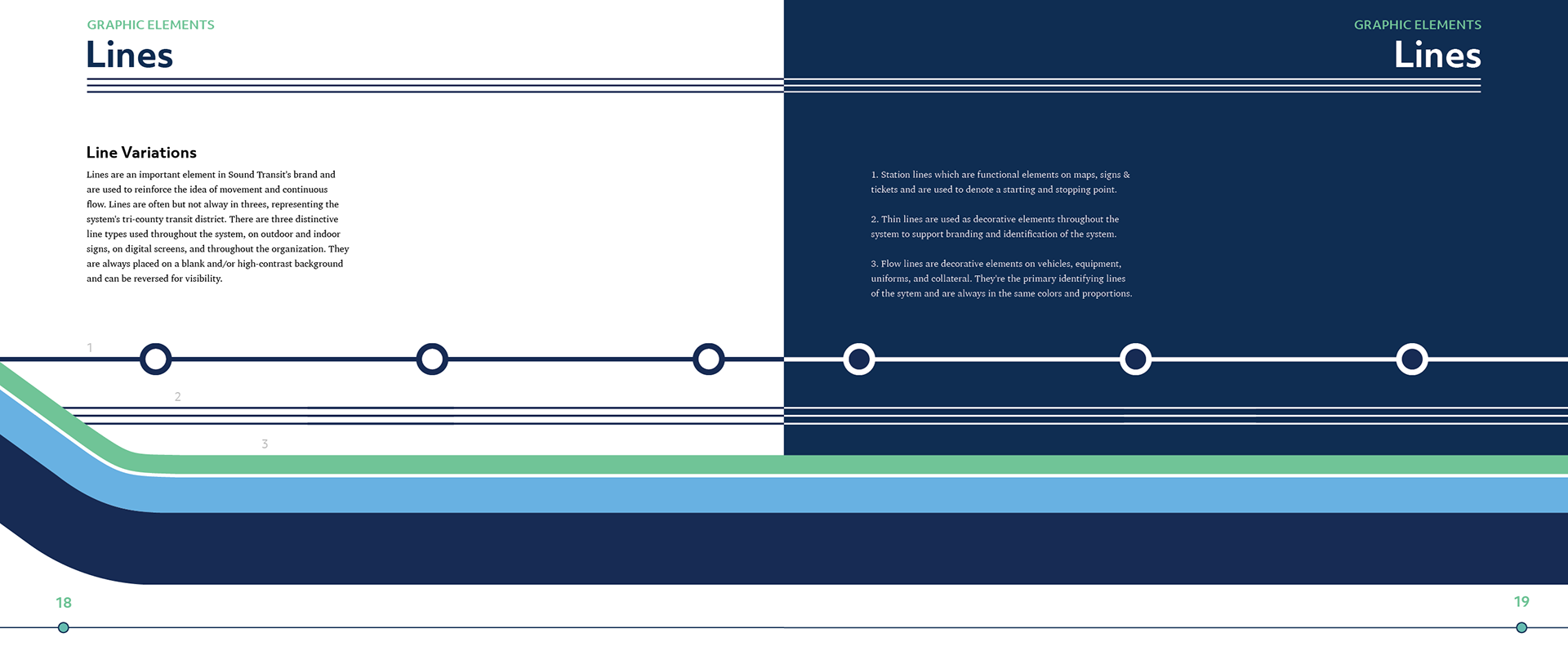
The brand's use of straight lines and dots seen throughout the brand guidelines promote the idea of an integrated system where you can travel quickly and transfer easily from place to place throughout the region.
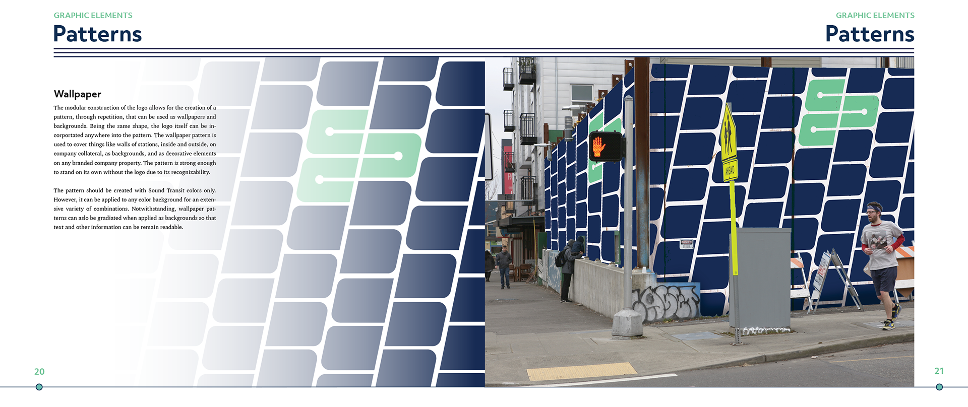
The logo can be expanded to created an easily recognizable pattern of the brand.