Poster for Dog on a Roof Productions' performance of Anton Chekhov's play Along the Highway.
One of the parameters for the poster was that the painting of Chekhov had to be used in the poster. The painting itself is captivating and so I retouched it with Photoshop and combined it with text in InDesign, creating a composition that captures the attention of the viewer from afar and focuses their attention to the important information at closer distances.


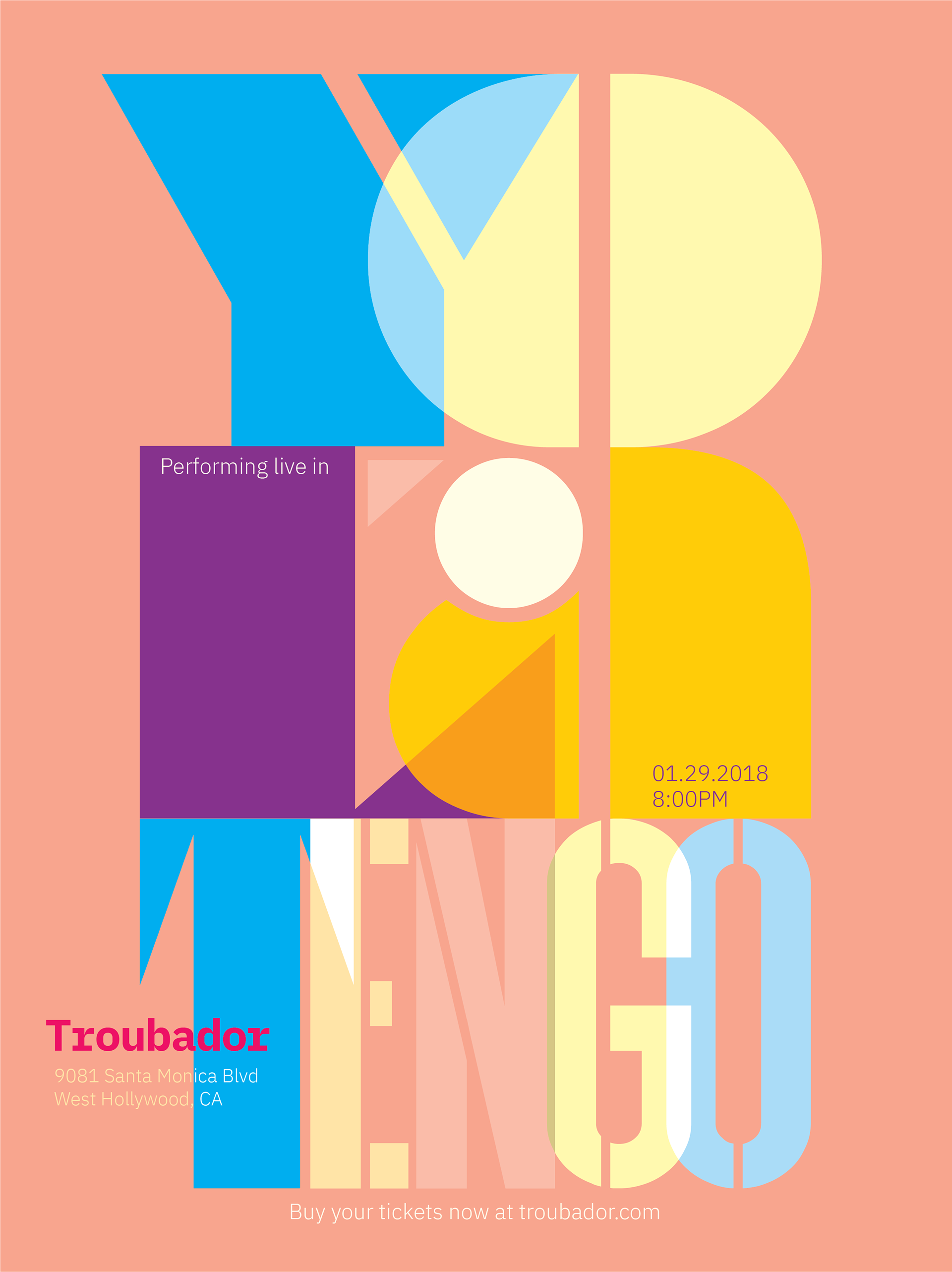
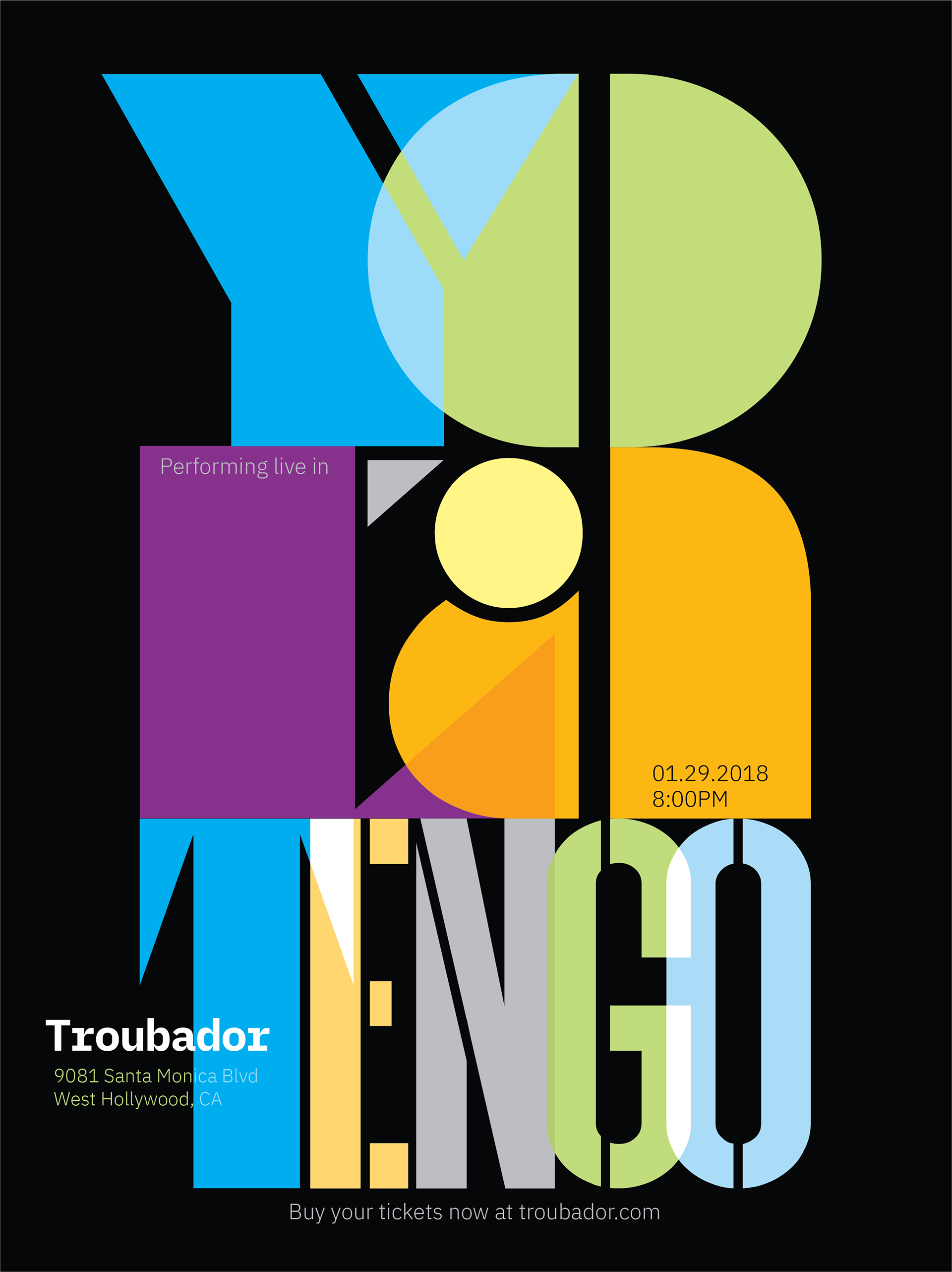
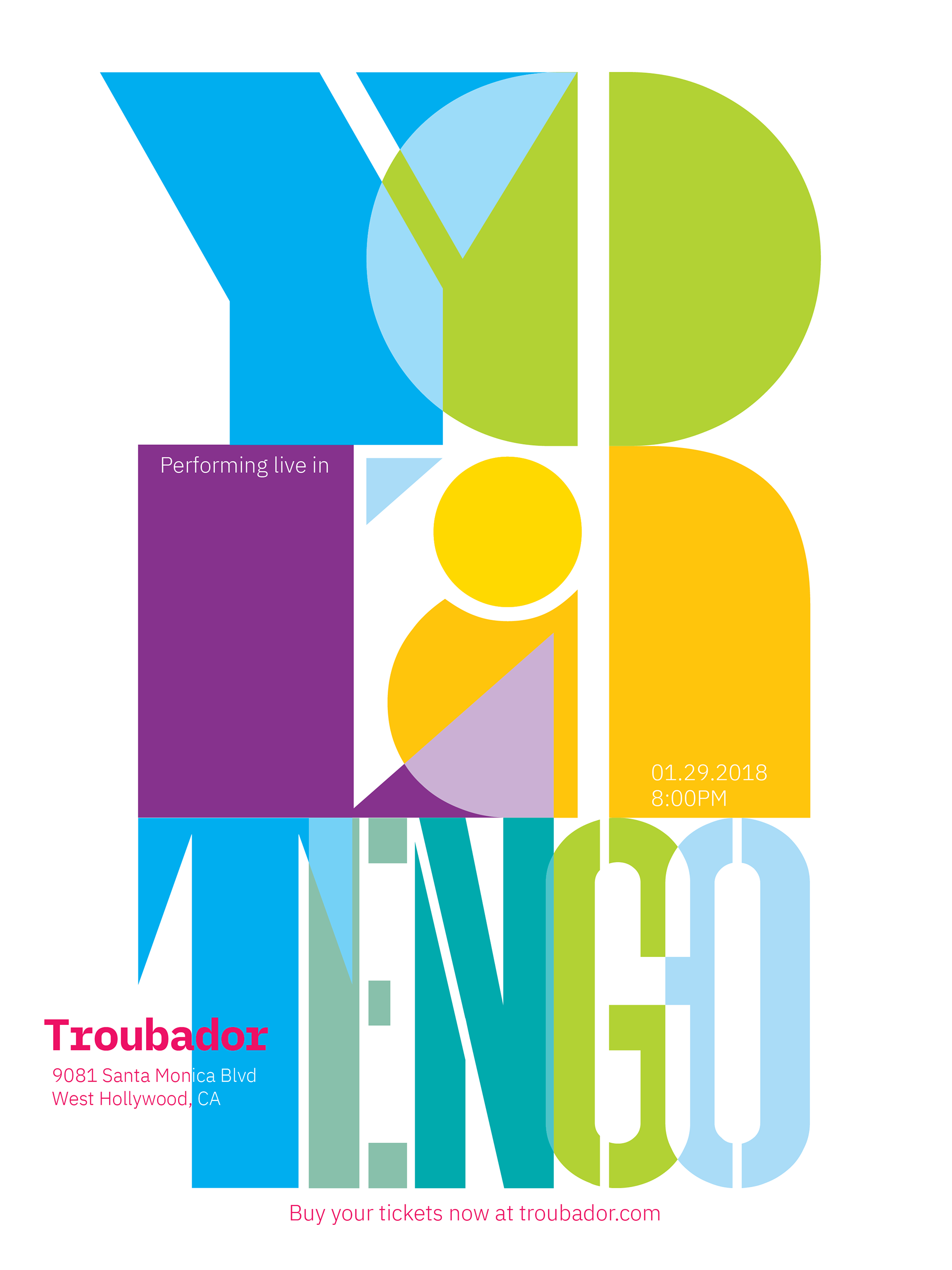
Gig poster for indie rock band Yo La Tengo in three color combinations.
As with all of my project work, I started with a considerable amount of research to explore overarching styles. Among the eclectic collection I noticed a predominance of interesting type, bright colors, and sense of nostalgia...so looked in those directions while putting my own stamp on the poster. The show takes place at the Troubador in Los Angeles, and so I make use of the letters "LA" in the band's name to highlight the show's location. The stacked lettering and geometrically-shaped type evoke mid-century modern art and architecture.
Craigslist ad translated into a poster.
The challenge of this project was to take an actual Craigslist ad and create a poster out of it to practice typography and composition on an angled grid. It's in black and white with the mop and bucket in color to stand out. The mop and bucket are mundane objects, but when appearing in and among various worldwide languages (with English as the primary) it becomes exciting, even mysterious to the viewer. At the same time, the item for sale, reaches a larger audience, all while communicating the same thing.
Spec graphics for the Seattle Mariners baseball team.
Poster for show called Question Reality at Space Between Art Gallery.
For the design of this poster I utilized my photo compositing skills to create a compelling image of a person in meditation. The idea, inspired by the show and gallery's name, was to depict the chaos of everyday life in the lower part of the poster juxtaposed with the peace and connection to nature above. The person, sits in the space between the two.

Poster for Seattle Science Fiction Film Festival at the Northwest Film Forum.
Taking color inspiration from science fiction films such as Blade Runner 2049, this poster was designed to evoke a futuristic feel and communicate the theme of the year's festival — We Come In Peace — a listing of sci-fi films that mostly depict peaceful and positive human encounters with the aliens and technology. I also designed the logo.
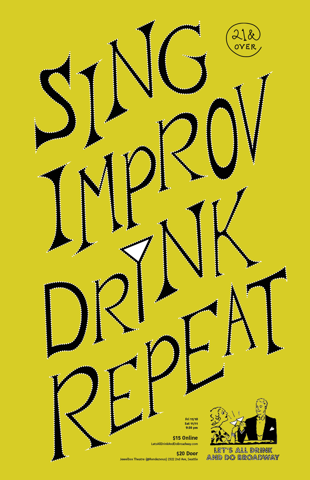
Poster for social event in Seattle called Let's All Drink and Do Broadway.
I took cues from the organization's already established logo (bottom right of the poster), which uses a dotted typeface along with two figures holding martini glasses. I hand-lettered the type, referencing the martini glass, which serves as a focal point and also a visual cue as to what to expect at the event. I gave the type a dotted outline to further connect the logo, and I varied the line thicknesses, baselines, and cap-heights to give the text an unsteady but fun look.